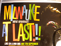
milwaukee at last!!!
by Rufus Wainwright
by Rufus Wainwright
Artist Representation:
- He is on the right of the advert looking up with closed eyes and a spotlight on his face.
- This makes him look more dominant in the picture as he is lit up and has colourful clothes on.
Mise-en-scene
- Artist on the right
- Large colourful text in the centre
- Artist name in the middle of text (smaller than album name)
- everything is either black or hardly lit apart from the main items (aka the album name, and Rufus himself)
- Artists website, Release date, information about product, free items (postcards), record label, stockists
Attract Target Audience?
- Magazine advert seems to try and attract a very wide range of potential audience.
- The font is brightly coloured and large (Could attract a younger audience, 16-20)
- the background is dark and gloomy and on the whole a lot more serious (attract an older audience, 20-40)
- Rufus Wainwright, Folk artist.
Conform to convention? Special content?
- In terms of a folk style genre, this advert does conform to genre.
- The text is similar to that of other folk style adverts, and gives a feeling of folkeyness.
Digipak Analysis

Suede
Lost In T.v.
Lost In T.v.
Artist Representation
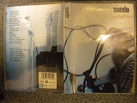
- No image of artist on cover, just fuzzy pictures of instruments
- Aimed at maybe a more dedicated fan base who know who the band is, as it doesn't really represent the artist in any promotional way.
- Mysterious because of no images of artist.
Mise-en-scene
- Fuzzy images of instruments, looks like tv screen
- Very simple, bland, just image, band name, and the album name,
- Album name is more interesting than anything else on the cover making the audience get drawn mainly to that.
- Track names on the back, and special features
- Company details, barcode, etc.
Attract Target audience?
- This Digipak seems to be targeted mostly at existing customers rather than new customers.
- Probably audience between 30 - 50
Conform to convention? Special content?
- Convention of rock/indie artist
- Glum, Moody, dark, generally pretty monotone.
- conforms to the moodyness of Indie/Rock Artists
- Special features (New track, commentary, short film)
No response to “analysis of magazine ad and digipak”
Leave a reply