We have finished our Magazine advert and our Digi-Pak. We ended up make 2 digi-paks, and we had to compare them and see which one our grouped overall liked the best and sold the artist the best and which one had a good relationship with the magazine advert. Overall i think that our magazine ad and digi-pak look really good and they have a good relationship. we used other style digi-paks like Madonna's for an idea on how we should base our ideas and what kind off style to go for. We also had a magazine ad which we could look at the layout and style and then put our own style, colours, pictures and texts in. We made sure that we used the same text, similar pictures and the same colour scheme in both the magazine and the digi-pak. I feel that there is a good strong correlation and relationship between our final music video and our other promotional products (Magazine advert and Digi-pak).
Our Digi-pak and Magazine advert have a good relationship with out final music video because they both have a very similar colour scheme and the images we used are ones we got during the filming so people are going to be able to relate them easily. They also have similar layout on where the artist is on the page and how they look in the picture. The mise-en-scene of them are very much the same because of the green screening we done and the layout and texture of the images, the make-up that we used on David Bowie is the same because we took the picture during filming, all that we have done is to make it stand out more by putting the contrast up and then just making it a little bit brighter. We also wanted to go for a modern and stylist look so we downloaded new brushes on our photoshop and made David Bowie look modern and stylized compared to his older style, but the comparison is very much the same and very clear. In our digi-pak i also tried to make it look as professional as i could by using record labels, bar-codes, screen settings, different settings for the DVD, sponsors, bbfc recommendations and the general style of them.
Overall i feel that the digi-pak and the Magazine advert, show off the artist and make the artist look very modern and professional.


Tuesday 24 November 2009
photoshop practice


these are some of the different styles of brushes that we use in our digi-pak and magazine advert.
this is just us testing them out and seeing what different looks we can get.
Wednesday 18 November 2009
analysis of magazine ad and digipak
magazine ad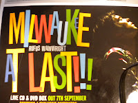

milwaukee at last!!!
by Rufus Wainwright
by Rufus Wainwright
Artist Representation:
- He is on the right of the advert looking up with closed eyes and a spotlight on his face.
- This makes him look more dominant in the picture as he is lit up and has colourful clothes on.
Mise-en-scene
- Artist on the right
- Large colourful text in the centre
- Artist name in the middle of text (smaller than album name)
- everything is either black or hardly lit apart from the main items (aka the album name, and Rufus himself)
- Artists website, Release date, information about product, free items (postcards), record label, stockists
Attract Target Audience?
- Magazine advert seems to try and attract a very wide range of potential audience.
- The font is brightly coloured and large (Could attract a younger audience, 16-20)
- the background is dark and gloomy and on the whole a lot more serious (attract an older audience, 20-40)
- Rufus Wainwright, Folk artist.
Conform to convention? Special content?
- In terms of a folk style genre, this advert does conform to genre.
- The text is similar to that of other folk style adverts, and gives a feeling of folkeyness.
Digipak Analysis

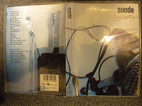
Suede
Lost In T.v.
Lost In T.v.
Artist Representation
- No image of artist on cover, just fuzzy pictures of instruments
- Aimed at maybe a more dedicated fan base who know who the band is, as it doesn't really represent the artist in any promotional way.
- Mysterious because of no images of artist.
Mise-en-scene
- Fuzzy images of instruments, looks like tv screen
- Very simple, bland, just image, band name, and the album name,
- Album name is more interesting than anything else on the cover making the audience get drawn mainly to that.
- Track names on the back, and special features
- Company details, barcode, etc.
Attract Target audience?
- This Digipak seems to be targeted mostly at existing customers rather than new customers.
- Probably audience between 30 - 50
Conform to convention? Special content?
- Convention of rock/indie artist
- Glum, Moody, dark, generally pretty monotone.
- conforms to the moodyness of Indie/Rock Artists
- Special features (New track, commentary, short film)
 This is one of our ideas for a magazine cover,
 using custom brushes and abstract colours that
match the genre of our music video, we have made
a fairly professional looking image.
we are currently looking for a suitable font for
information then we will upload a draught of the final
product.
magazine ad and digipak
there are certain aspects of the promotional material that are needed in them, such as:
Function Of A Magazine Advert
-promote the video and the artist
-name of the artist
- album
-reviews from
-celebs
-music press
-newspapers
-name of labels with logos
-where the product is available
-eye catching visuals
-websites
-myspace
-official
DigiPak
-showcase the artist
-menu
-collector items
-limited edition
-special features
-out takes
-video documentary
-making of the video
-interviews
-live performance
-interactive content
-guitar hero
-competitions
-bonus tracks
-exclusive
-uncut version
-short film
-artists work/personal work
these are some of the things that we are going to be thinking about and including in our products.
Wednesday 11 November 2009
artists
New Artist-
Rick Astley-never gunna give it up
http://www.youtube.com/watch?v=Yu_moia-oVI&feature=related
Madonna-like a virgin
http://www.youtube.com/watch?v=VJ1Q_cZTYGI
Artists-
David Bowie-life on mars
http://www.youtube.com/watch?v=v--IqqusnNQ
Elton John
http://www.youtube.com/watch?v=Y2Ta0qCG8No
Vanilla Ice-ice ice baby
http://www.youtube.com/watch?v=rog8ou-ZepE
The Beatles-at the cavern club and money
http://www.youtube.com/watch?v=90Li7n56uU8
http://www.youtube.com/watch?v=E3m-gOelA8g
Westlife-Flying without wings
editing.
so far me and Ollie have change the vanilla ice section Agni and put a video behind him as he sings of a wall of graffiti. just like in there video. we got the cideo from youtube and then copied it in to out sequence.
we have also put small freeze frames in on the beats before the vanilla ice section to fill the gap and to show the audience the next artiest.
we also changed the fade we had on the artist to a blast of white colour from the artist and then a zoom in to the artist and then the screen goes completely white for about 3sec as you begin to see the slow-motion boyband, walking down the stairs.
we have edited the 'westlife' footage by slowing it down and making it more stylized by making it black and white and putting a blue hue over the top to give it a boyband stylized feel. We put small clips of all the artistes featured, on the beat at the break-down. Then when the singing comes back we show the boyband singing for the last time and then we will have 'Rick Astley' in the court yard singing and small bit of dancing, then it will jump to 'Madonna' dancing and then singing the last bit of the chours, then it will finish with her turning her back to the camera and her walking way or of her slowing fading in to the distance.
The Rick Astley section wont take long to edit all it will need is cutting up in to section of footage and then possibly putting a grainy effect over the top.
The Madonna section will need a little bit more because it will need to be green screened and then cut up and hen put in with the rest of the footage. if anything goes wrong then will need to just put some old footage in instead. it will be a shame.
we have planned it enough to get it all done just in time.
we have the last lesson to finish the rest of the video.
- 40mins filming
- 20mins cutting it up and getting the right bits of the footage
- 30mins eding it together and making it look good.
last lesson
We need to film one more act from 3.00 til the end at 3.30.
we've got ideas of -Madonna
-Rick Astley
We will do Rick Astley from 3.00 till 3.17
then Madonna from 3.17 till 3.30
this will be doing 2 chours and 2and a half instrumentals with Rick Astley, and then Madonna doing half and instrumental dancing then singing the last chours.
costumes-
Madonna- Patrick- dress and lots of necklaces and we will mess his hair up in to a poofy style.
Rick Astley- Ryan- plain black top with possibly a cream coat then ill style my hair so its slicked back and possbly with some glasses.
location-
madonna- will be green screened and then a picture of the river behind, but we will also shoot some short dance bits.
Rick Astley- will be outside in the tennis corts, agains a fence. like in the video.
editing
We have started the final stage of editing in our last lesson, we moved some footage about and we started editing the new footage we shot in the early part of the lesson.
We have booked our computer after college today so we can finish all of our editing and make sure that we have the last lesson on Friday to polish it and make it the best it can be.
me and Ollie have started the editing in the previous lesson and we know what needs to be done to get it up to scratch.
reshooting
last lesson we re shot our top layer on our 'vanilla ice' section, so it fitted with the lyrics and fitted together smoother. We also re shot the whole of the 'westlife' section because the footage before wasn't very good and it would have looked rubbish. so we planned our footage out this time and made sure that we had the right green screen.
We are planning to have another time to shoot another artist like 'Madonna' because at the moment the footage finishes at 2.20 and the track finishes at 3.30 and 'Westlife' would become abit boring and repetitive, and it wont fit the the speed of our track and editing so far.
We are planning to have another time to shoot another artist like 'Madonna' because at the moment the footage finishes at 2.20 and the track finishes at 3.30 and 'Westlife' would become abit boring and repetitive, and it wont fit the the speed of our track and editing so far.
Wednesday 4 November 2009
Peer Feedback Group 03
Artist representation - close ups and star image
The video has a great use of artist representation as it shows the separate members of the group doing legendary artist impersonations, featuring many close ups with good costumes and lighting effects.
In Evaluation, parts of the video are missing, which takes away a certain feel that is brought by previous footage. However the shots you do have fit the song, and follow your pitch ideas greatly, which makes what footage you do have work very well.
Lyrics and visuals feedback
Some good lip syncing.
Patrick's bit was impressive and caught the mood of the lyrics well.
quite hard to work with the lyrics as it doesn't have many.
overall well done with the lyrics.
It will be really good once you've finished the editing and have all the different bits cutting between each other and filling out the whole song.
Feedback from group 5
good use of green screen at beginning and also taking advantage of make up used in the editing process to blend the eyes and hair giving a mystical effect.
Also the slow fade in at 37 sec look very professional.
the piano scene works well to provide mild humor and also it is very similar to madness videos in the way that the piano is obviously not being played properly but the audience dont really notice this due to the comical factor.
the music and visuale link well by including performances throught out the video, for example a drummer drumming to the beat of the music.
obviously the video has not yet been finished and the group could include more graphical effect, maybe in the form of words on screen
Rough Cut- Peer Feedback
I think if the group are going for a cheesy techno 80s feel video, they are doing pretty well. The use of special effects and filters works well and fits the music. There are quite a few gaps but what's there is strong. There is no strong narrative to the video but I don't think there is supposed to be. The performance aspects may drag on too much.
re-shooting
our rough-cut deadline has been meet and we have some blank spaces where we were going to put different sections of footage, but some bits of footage weren't long enough and some bits really didn't look good. But we had already decided that we going to re shoot some bits of footage, like the westlife section because we didn't really have enough planning time (after being told that we have no time in the music room).
Plan: i think that we should us the dolly and pan round a the group and get close-up shots of us in the camera, this is conversations in some westlife videos. also we will shoot a long shoot of us as a group and a moody shoot of us. They will all be conventional shoots from different styles of boyband videos.
costumes: They will be very similar to last time, just smart shirts and jackets and shoes. But i think that we should so one shot with us more casual, and more like a group of Friend in a boyband. also in videos if convention.
location: i think that we should shoot it in the same location as last time, up of the stage and in the main hall, you get allot of natural light and we can mix it with artificial lighting, to make it look brighter.
booking: we will need to book a time to use a camera, lights, tripod and dolly.
This will fill the spare time that we have in the middle for the boyband section that we already have.
Tuesday 3 November 2009
Rough Cut Feedback TAW
Some of you footage is very impressive. It is well styled and lit and the artists you are referencing are clear. You need to finish a basic edit to show how the shape of the video is going to emerge. You should continue to work in the detailed way in order to get the best out of each set up. Well done.
last lesson
due to the Friday before half term being off and our last lesson was then! we have been given an extra day of editing. this lesson we are putting all of our footage together and putting all the green screens on and make sure they all go together well.
ten when we have been given out feedback we will put all the full effects on and just tweak it to make it perfect and if we need to (which we do) we will have a bit of time to re shoot some section or bits of footage.
editing is going well so far all the footage is going together well and it all fit and looks really good and effective, very eye catching to a audience.
Monday 2 November 2009
so far...
So far we have filmed everything and made a good start in the editing. We still have a bit to do on it, but mainly just getting the green screen perfect and the shots slotted together. we have been lucky enough to be given one more day of editing because we miss a day due to the friday being a holiday.
We did have some trouble with filming because we booked the music room for lunch and a small section of the next lesson on the monday, BUT when we got there cut it down to abit of lunch, so we couldn't get all of our 'Beatles' footage, so we decided to add in a small boyband section to also have more contract with the other footage and to also replace the other half of the 'beatles' section. The boyband we decided to do was 'Westlife' because there are a big, well known band that fit to the stereotipical boyband image.
Because we were filming our 'Beatles section on the last day of filming, and we couldn't finish it all, we had to pretty much make a rough plan of our 'Westlife' footage and the go by it because we only had limited time left. The footage came out good enough so we known that we need to reshoot it, but we know what we need to shoot.
The current order for our footage is:
-David Bowie -footage really good and all the editing is done. The green screen is really good with these section because it looks all retro and slightly old and this looks just like the Bowie section of 'life on mars' that we aiming to achieve.
-The Beatles -A small section of close up to medium shots of the drummer to fit to the beat. looks really good and the editing is finished on that, it was green screened as well but it doesn't look as good as the Bowie footage. But i think that we should put an image behind instead to make it more apealing and more bolder, we can make it fit to the retro 60's age of the 'Beatles' instead of a plain edited background. The costumes were just smart suits and we gelled our hair if we had hair that was to long to make them look like bowls.
-Elton John -The footage looks really good and quite cheesy and funny, but not intentional. we haven't green screened it but we have done many different shots, long, medium, close up of face, close up of feet, close up of keys. Just so we can get the right but of footage. So far we have only used a medium shot at the beginning and a close-up at the end because we wanted to make it it like the 'crocodile rock' video. We have put some colour hue and saturation filters over it and other editing techniques on it to make it look colourful but still keeping to the conventions on the video. The costume was smart suit and some pink heart shaped glasses and i styled my hair to make it look like his. The footage also looks effective in the way that the ginger hair is really eye catching.
-Vanilla Ice -the footage is good, but it could be better. But it looks really effective because the background is of the stage and we have lots of different props on the stage to make it look like an abanded warehouse, and we have put no natural lighting on it it all artificial and its been put only in sections, so it like light is just seeping in, it looks really effective. we also put a dance to this and there are bits that look really good and bits that don't... we have finished all the editing on this but we have the last lesson to finish this section for the rough-cut deadline. The costumes were just trackies and baggie top, a retro hip-hop look.
-Westlife -This was done on the spot because of the music department. We know what we have have to shoot, we just need to re-shoot it because the footage looks pretty bad, but on a whole it looks really effective. We all had our costumes because we had it from the 'Beatles'. When we re shoot it and finished with a slow motion editing it will look really good but for the rough-cut it will look average.
So far the editing has gone together really well and it all seems to fit. We have green screen quite a lot of our footage so it takes that little bit longer to edit because we need to get the right quantities green edited out without cutting any of the artist. The timing is good so far we just need to put it all together for the rough cut and see what we need to do to make it better or to add on more of a certain section.
Personal at the moment i am really pleased with the footage and i am really looking forward to getting it all together and finalized. It should really good and it bit quite funny but not intentional. All we need to do now is to finish all the editing on 'Vanilla Ice' and 'Westlife'.